A transformative
rebrand.
Imprint Genius is a technology and promo company deeply rooted in fulfillment and e-commerce. The objective was to create a brand identity that honored the fulfillment sector while capturing the company's innovative vision — building something that communicates both precision and intelligence.
The project encompassed logo design, brand identity, and a comprehensive guidelines system — all developed with geometric discipline and a focus on lasting visual impact.
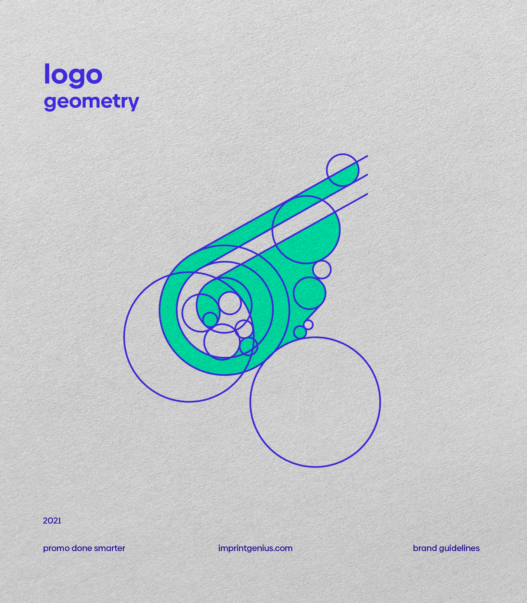
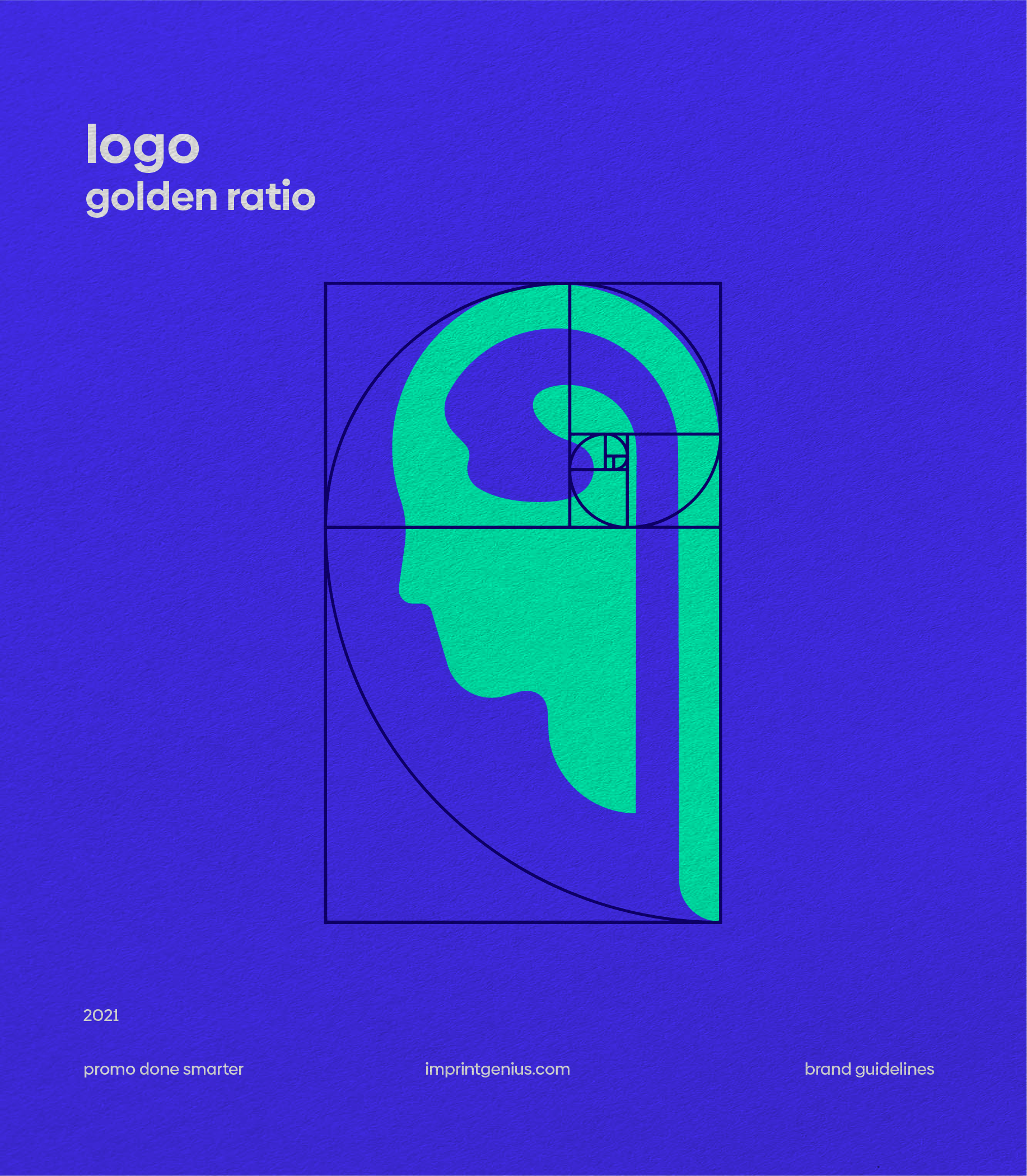
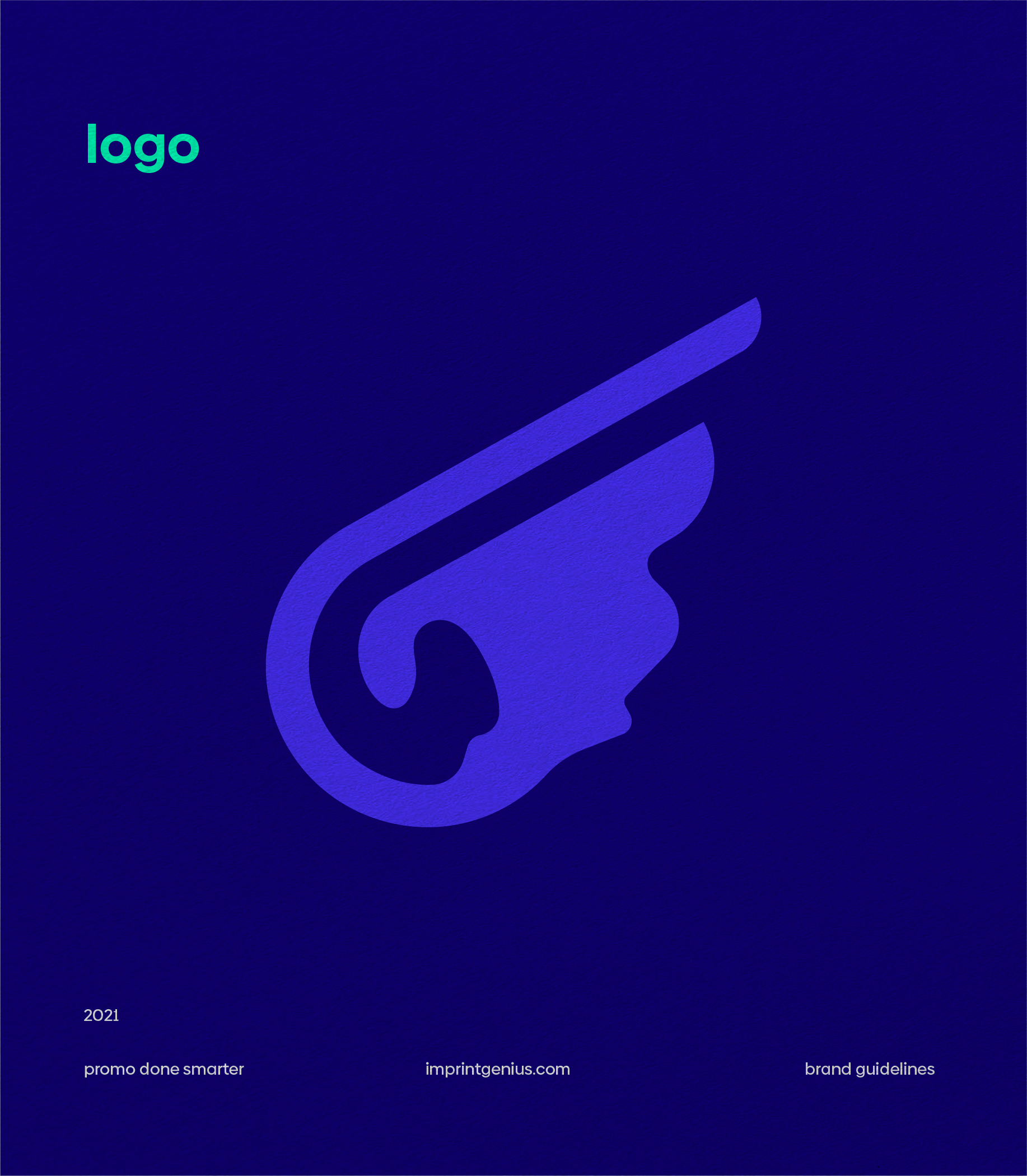
A dual-meaning mark built on precise geometry — wing imagery representing global fulfillment that rotates to reveal a human head and brain, symbolizing genius.
A cohesive visual system spanning color, typography, and application — built to scale across digital, physical, and promotional touchpoints.
A comprehensive guidelines document ensuring consistent application of the brand across every format and use case.
Two meanings,
one mark.
The wing imagery represents global fulfillment and swift, reliable service — a nod to the company's core business. But the mark holds a second meaning: rotated, the logo reveals a human head silhouette with a brain, directly embodying the "genius" in Imprint Genius and symbolizing intelligent business growth strategy.
This dual reading gives the mark depth and longevity — a symbol that rewards closer attention and carries the full weight of the brand story within a single, elegant form.
Symbol of
swift genius.
Wings in motion — global reach, rapid delivery. Inverted, a mind in focus — strategy, intelligence, growth. The Imprint Genius mark says both, simultaneously.
"The true artistry lies in harnessing the power of perfect geometry to fashion designs that resonate with lasting impact."
Design Philosophy — Imprint GeniusBold, minimal,
unmistakable.
The wordmark was designed for clarity and versatility — bold and minimalist in form, available in two configurations for flexible application across formats. A subtle curved element mirrors the letter "i" in "imprint," creating visual cohesion between the mark and the letterforms.
Every typographic decision prioritizes longevity over trend — a wordmark built to hold its own at any scale, in any context.
Two formats,
one voice.
The wordmark ships in two configurations — stacked and horizontal — allowing consistent brand expression across business cards, packaging, digital interfaces, and promotional materials.