Colorido
A logo and packaging system for an international chocolate company — bringing happiness and color to consumers through design.
A logo and packaging system for an international chocolate company — bringing happiness and color to consumers through design.
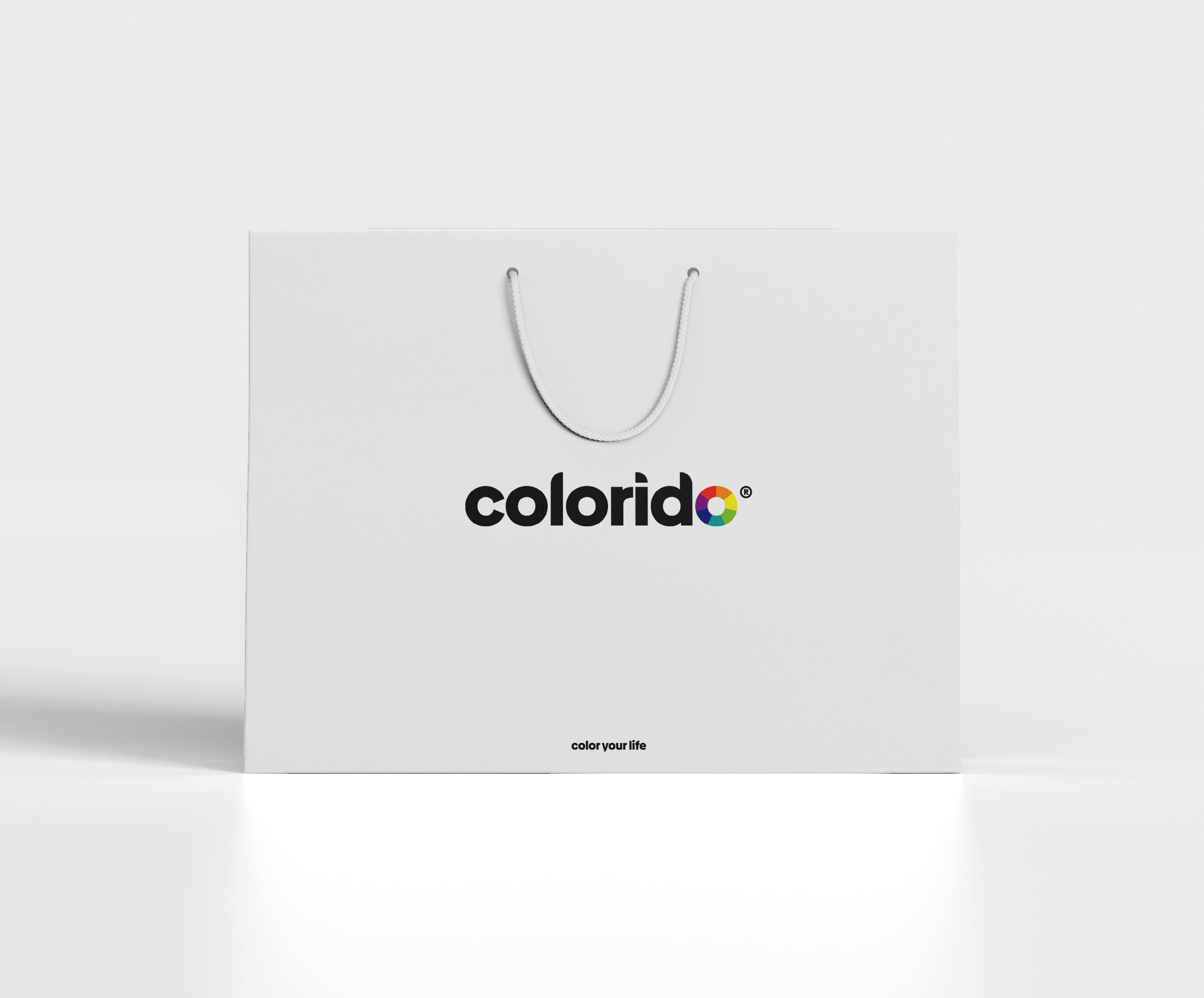
Colorido is a logo design and packaging project for an international chocolate company based in Taiwan. Their purpose is to bring happiness and color to the lives of their consumers — creating the highest quality dark chocolate snacks from the world's leading cacao sources.
The design challenge was to translate the brand's core values — happiness, color, and quality — into a visual identity that could hold its own on shelves globally while feeling personal and warm.
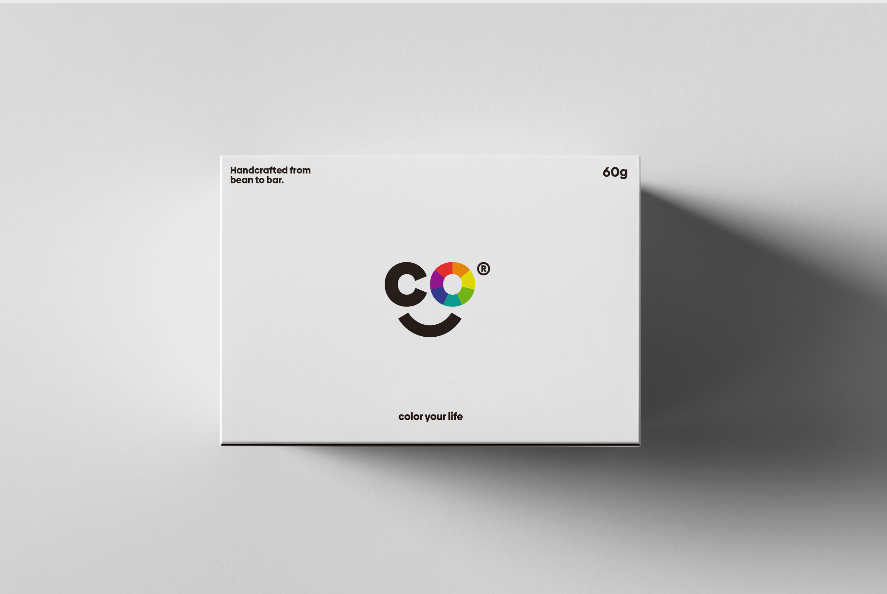
An icon built around the brand's core keywords — happiness and color — expressed through precise, joyful geometry.
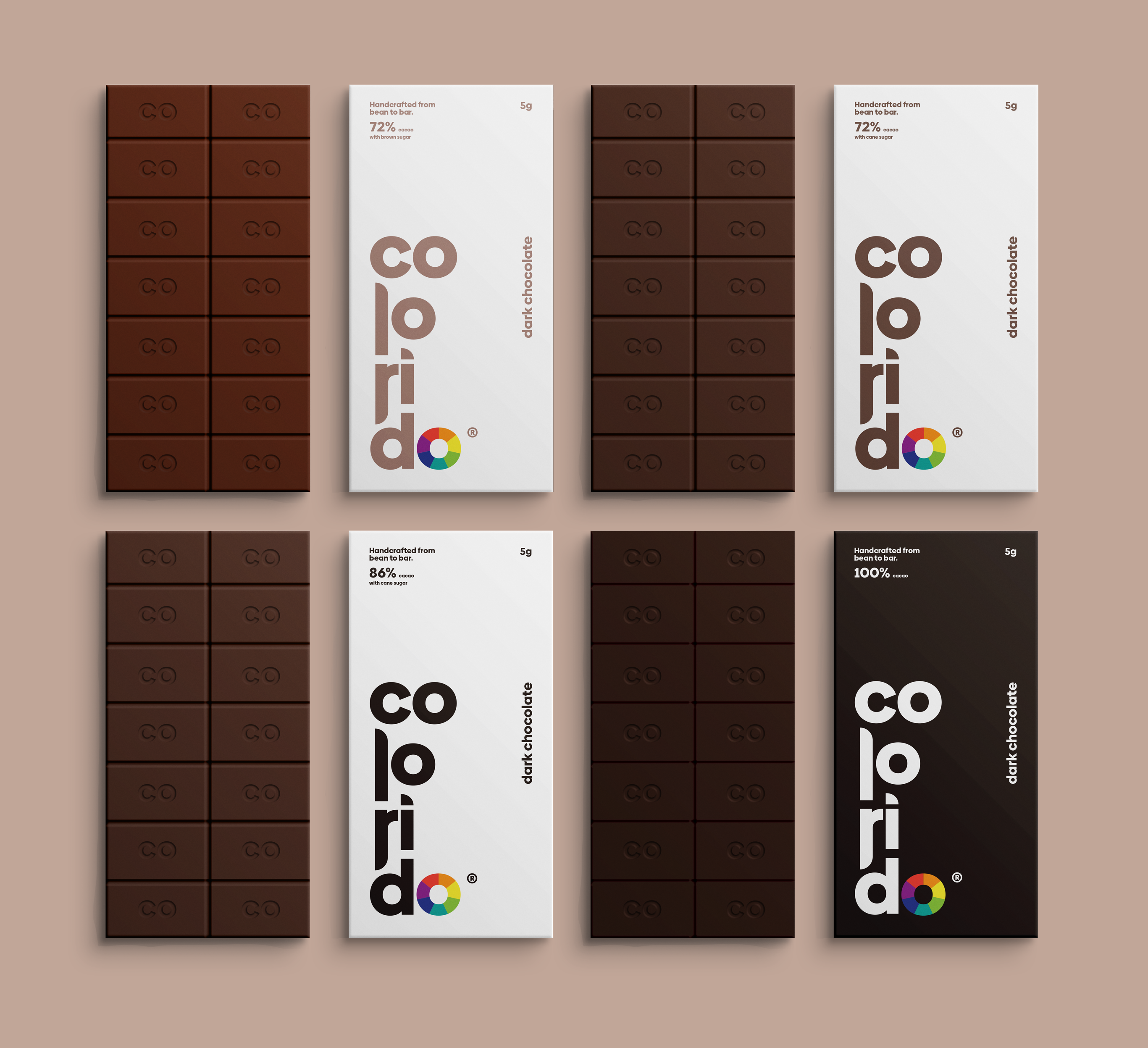
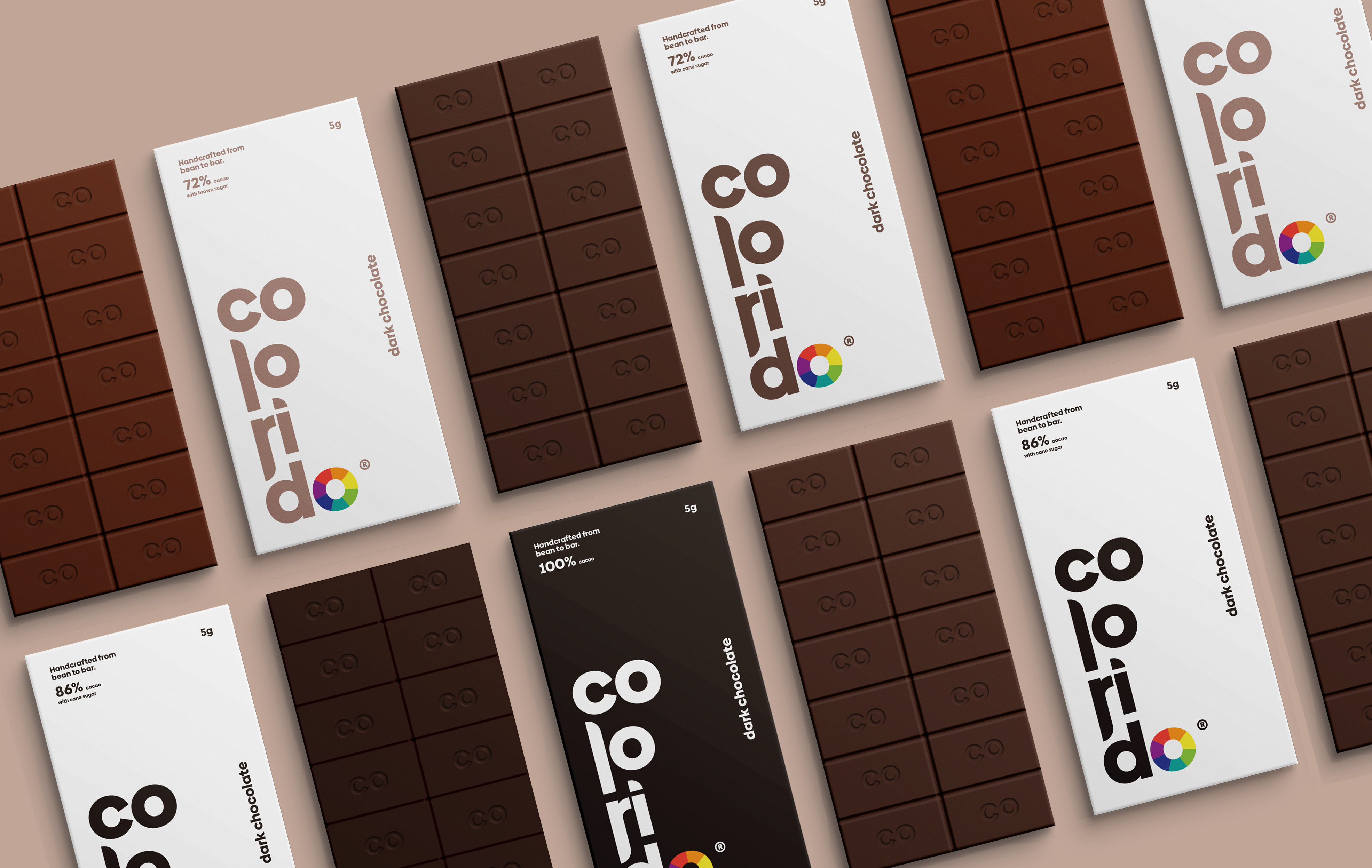
Individual bar packaging that retains consistent brand elements while using color to distinguish flavor profiles across the product range.
A cohesive visual system designed to scale — from individual bars to full product lines — without losing clarity or personality.
The icon was designed around the brand's two defining keywords: happiness and color. Every decision — form, weight, proportion — was made in service of those values. The result is a mark that communicates instantly, warmly, and without explanation.
Good brand icons shouldn't need context. They should carry the entire feeling of the brand in a single shape.
The Colorido mark distills joy into geometry — a symbol that feels as good to look at as the product tastes.
"We want to get straight to the point. Multiple elements coinciding at once is sometimes too much to handle, so we stuck to the basics."
Design Philosophy — ColoridoEach bar's individual packaging retains the same core elements — logo, wordmark, structure — while differentiating through color. Each flavor has its own palette drawn from the chocolate's taste profile, creating a family of products that feel both unified and distinct.
Clean, simple, happy. The system is built for shelf impact and shelf life — easy to extend to new flavors without losing the identity.
Color does the heavy lifting — each variant stays within the brand while standing apart on the shelf. The typography and structure stay fixed; the palette shifts.